Find Reverse Engineer in NIKE AD, “Just do it” Campaign

Original AD published by Nike
Found at: (https://www.businessinsider.com/25-nike-ads-that-shaped-the-brands-history-2013-8)
New AD created by Jeongmin Kim
logo found at: http://clipart-library.com/free/nike-logo-png-transparent.html
image found at: Source: https://unsplash.com/photos/4ng2Q432boo

Introduction

Nike started a three-decade run of classic advertising with its “Just do it” campaign in 1988. Those three words summed up the brand: do whatever it takes to win, no questions asked. Throughout the campaign, Nike enlisted a range of people from varying ethnicities and races, as well as numerous notable athletes, in order to attract customers and promote the image of Nike as being reliable to not only everyday customers but professional athletes.

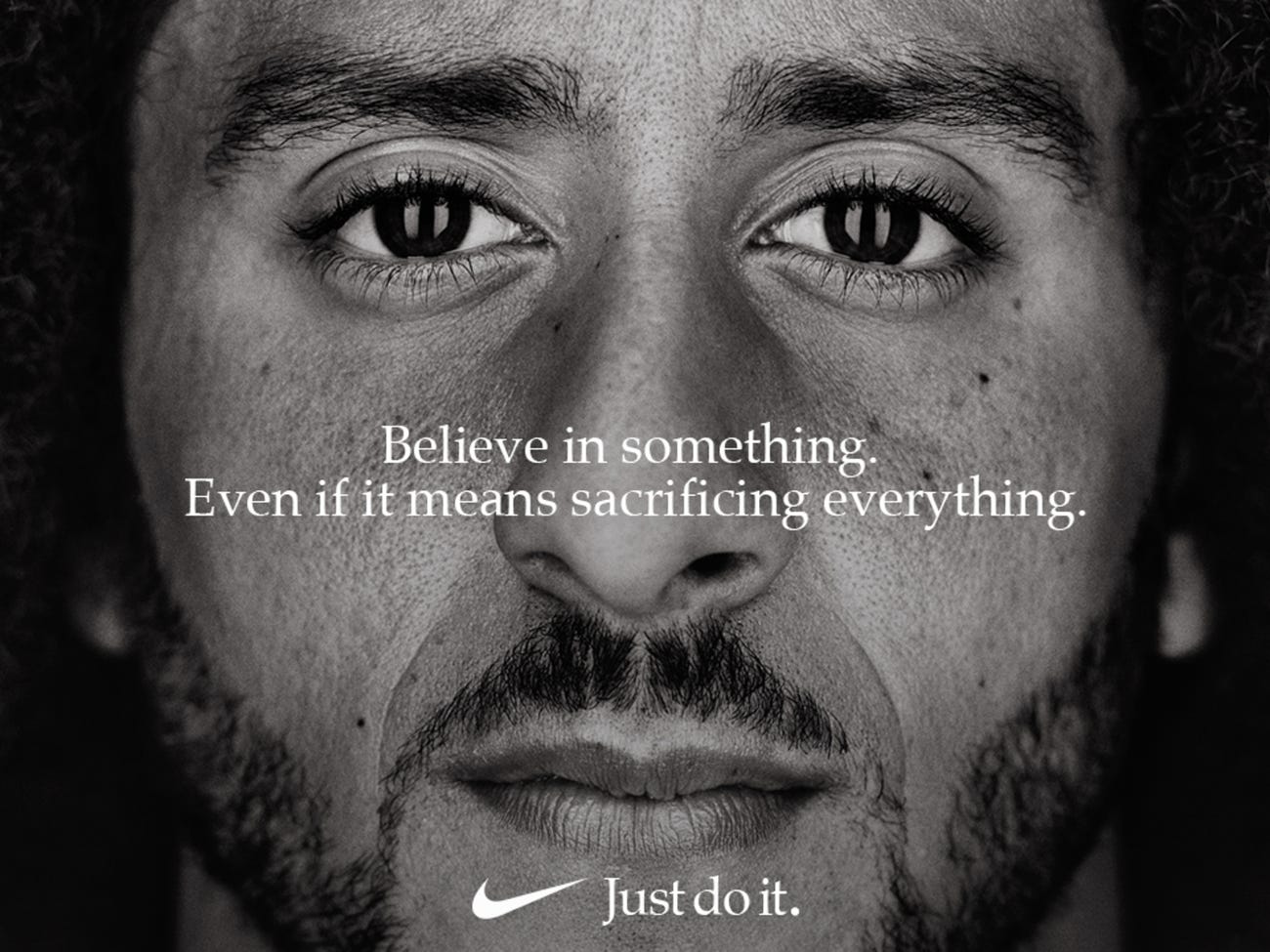
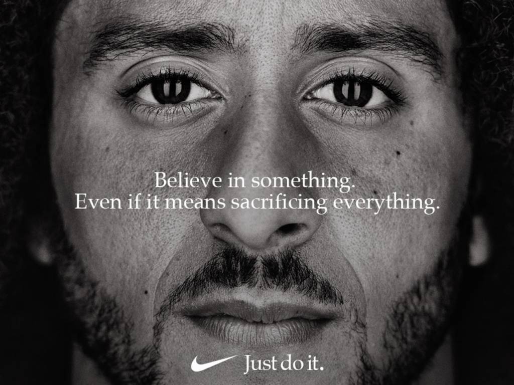
This advertisement was published by Nike in September 2018. The person on the advertisement is Colin Kaepernick, who was a National Football League(NFL) player and who spoke up against discrimination and oppression against black people in August 2016. He parted with his team soon after, and then Nike recruited him in 2017, even though there were lots of criticism about it.

Original AD Analysis

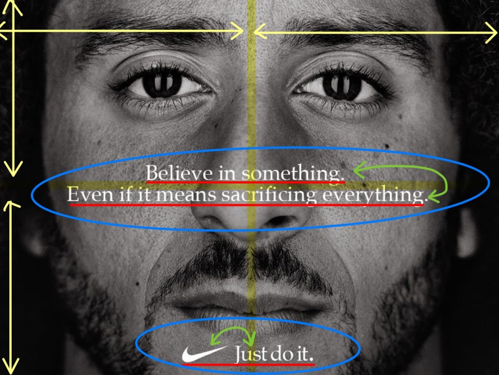
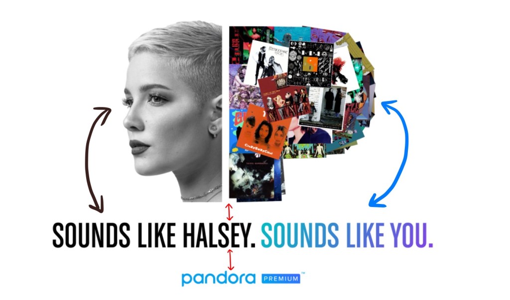
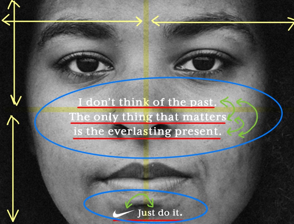
First, this original advertisement shows contrast in using a black and white picture, as well as using white for the color of the fonts and logo.

Second, they used the same font consistently throughout the advertisement. The font used is from the Serifs family, which has all curved strokes in the forms of the letters that transition from thick to thin. As they used the same font for the body copy and campaign’s slogan (“Just do it”), it created a unity.

Third, because of the differing widths between the text (blue circles), viewers’ eyes automatically go to the main message, as it is the widest grouping of text, and then go down the ad to the smaller group of text, which is more narrow in comparison.

Fourth, I would like to focus on the alignment. If you look at the yellow lines, you could see that Kaepernick’s face is centered in the advertisement. The main message, logo, and campaign slogan are also placed in the center horizontally (red lines), just like Kaepernick’s face. Also, as the main message is center-aligned horizontally and vertically (red lines).

Additionally, the proximity of space between the sentences in the middle are narrow(green drawover); this is the same as the proximity between the Nike logo and slogan on the bottom. We can find the repetition of the center-alignment and division between main message of the ad and slogan.
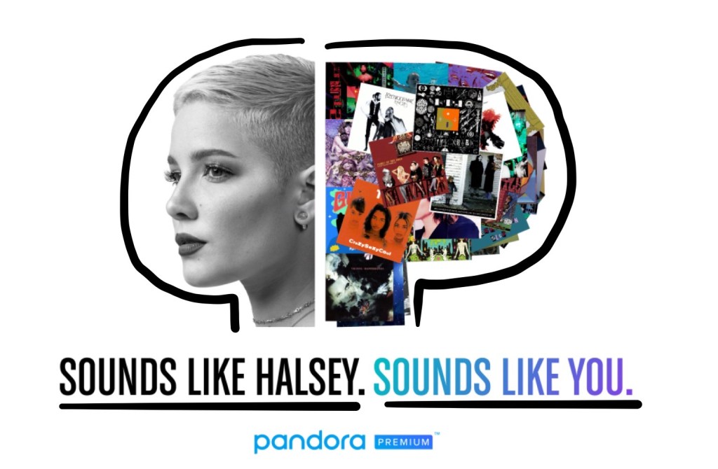
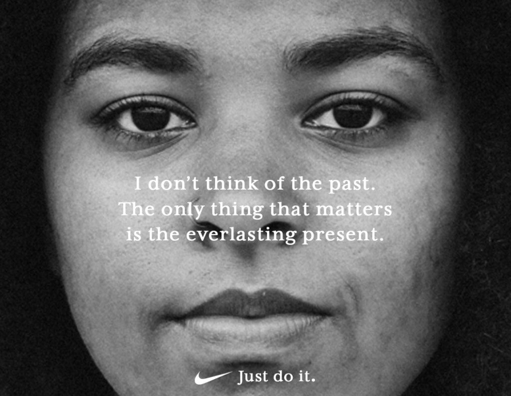
New AD Analysis

I drew over the new advertisement that I created. I used the same general design by using a black and white photo of a woman’s face,making it close-up and centered on the advertisement. I also could not find the exact same font from the Kaepernick ad, so I used a font from the Serif family in order to make the connection between my ad and Nike’s ad.

Additionally, the two groups of text (the main message, and the logo and slogan) are centered on the ad, mimicking the composition of the Kaepernick ad. Similar to the original ad, I also varied the widths between the two groups of text, so that the viewers’ attention will go to the middle of the the ad first, where the main message is, and then continue down to the bottom, to the logo and slogan.

Conclusion

As I analyzed the original ad and identified the original rules and design of the composition, I was able to apply them to make a new, but similar, advertisement of my own that is still unified with Nike’s ad and campaign.

Different Techniques of Designs in Articles

https://media.ldscdn.org/pdf/magazines/ensign-february-2017/2017-02-00-ensign-eng.pdf?lang=eng

Introduction

This is the original non-edited version of the magazine layout that I am going to describe. These two pages are from Ensign published by The Church of Jesus Christ of Latter-day Saints in February 2017. These pages were used for the introduction of Portraits of Faith, which is a series featuring faithful members of the Church living the gospel around the world. Cody Bell took a picture of Adriana Gonzalez and her daughter around the kitchen table, which has a special meaning to Adriana.

Category of the Typefaces

We can find two different categories of typeface that were used for this article. It includes Modern typeface and Sense serif typeface. Modern typeface was used for the paragraph in the blue box as well as for the name of the woman. Sense serif typeface was used for the paragraph in the yellow box and for the name of the photographer.

Two Typefaces Contrast

Modern typeface

This first picture is an example of Modern typeface. We can see that it has radical thick/thin transition in the strokes(e), vertical stress(o), thin and horizontal serifs on lowercase letters(top of letter k), curved bottom line and thicker at the tip(k), no bracketing(W).

Sense serif typeface

This second picture includes an example of Sense serif typeface. There are no visible thick/thin transition in the strokes overall, and letter-forms are the same thickness all the way around. We can also find no serifs(the edge of every font) and no stress as well.

As I have mentioned above, two typefaces from different categories were used. These two typefaces have a contrasting relationship, so it appeals and draws the readers’ attention. I have marked the distinction with square boxes in each picture. In the text field of this article, we can recognize that each paragraph has different contents as text fonts are from different categories.

Photography

Depth of Field is mainly used for this picture because Adriana is the focus of this article. We can see that because 1. She is the biggest form in the picture. 2. She is the most clear in the picture as everything else around her is out of focus. 3. She is also wearing the color(red) that contrast to the environment that she is in.

Alternate Images

Like the photography used in the original article, I used the depth of field photo composition. I also tried to take pictures related to the article. Because the article talked about her experience when God answered her prayer, self-reliance, and family, I chose the following subjects for my pictures.

The first picture is one of the plants in my living room. I thought taking care of plants is very similar to strengthening our Faith in that we have to keep nourishing it. As Adriana is working on food in her picture, we also need patience, dedication, and consistency to build up our faith just like taking care of plants.

The second picture is the scriptures, which are the word of God. I had others books next to the scriptures, but I focused on the scriptures to show that the gospel should be the center of our lives. Similar to Adriana’s table, although I have several books, I still choose to put scriptures in the center of my life.

The last picture presents family scripture study. As Adriana mentioned, through studying the scripture, we can discover who we are as His children and be more self-reliant. As we read the scriptures as a family, we can help and strengthen each other as well.

Summary

Using different typefaces in the article helps distinguish descriptions from the article’s actual content. Using the depth of field composition helps us see who the article focuses on, as well as give us a general idea of what the article will be about, s the photograph not only depicts Adriana, but her kitchen and family as well, which she references in the article.

PANDORA ADVERTISEMENT ANALYSIS

By : Pandora

Introduction

This advertisement was created by Pandora in April 2017, it was specifically for promoting one of their plans, the Premium Plan. Pandora is a leading music and podcast discovery platform, and it provides numerous content to users based on the plans. There are about 70 millions Pandora users. The original design can be found at : https://blog.pandora.com/us/sounds-like-you/

Contrast

In this advertisement, we can find several contrast elements. The white background contrasts with the pictures and text of the advertisement. We can also recognize it is as separated in two parts, Halsey’s face and text below her is juxtaposed by the letter “P” made up of several album posters with corresponding text below it.

Alignment

In this advertisement, the pictures, text, and logo are center-aligned. It helps the viewers to feel the content of the advertisement belongs to the same piece, and it keeps this advertisement looking unified and organized.

Repetition

We can find some repetitions in this advertisement as well. It is used for the shape of the pictures, the font of text, the size of font, and the wording of the sentences. It is helpful for drawing attentions from the viewers.

Proximity

Proximity is also founded in this advertisement. They used black and white coloring for the left content and colors for the right content. It helps the viewers to recognize the relationship of the content (Halsey’s face – SOUNDS LIKE HALSEY / “P” – SOUNDS LIKE YOU). The gaps between the content also show proximity. The gap between the pictures and the text, “SOUNDS LIKE HALSEY. SOUNDS LIKE YOU,” is shorter than the text and Pandora logo. This spacing helps organize the content in the advertisement into several units.

Color

Pandora used only few colors to keep this advertisement simple. Overall, black and white, and a triad of colors(yellow-orange, aqua, and violet) is used in this advertisement. They even used the triad of colors mostly in the “P” with a bunch of album posters. They also kept the signature color for their logo, which is aqua. The text, “SOUNDS LIKE YOU” uses shades and tints of violet color. Overall, it creates harmony.

Conclusion

In this advertisement created by Pandora, basic principles of design (Contrast, Alignment, Repetition, Proximity, and Color) are used. These principles make the advertisement more clear, interesting, organized, and unified. I think it worked very well in this advertisement. Although it is very simple and short in wording, it delivers the messages well.

Design a site like this with WordPress.com
Get started