Introduction
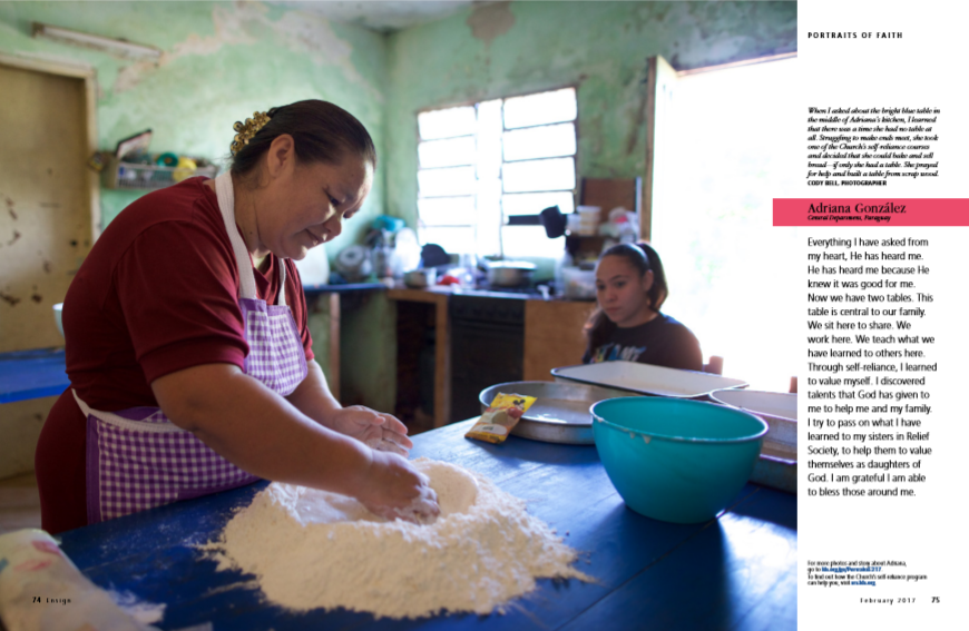
This is the original non-edited version of the magazine layout that I am going to describe. These two pages are from Ensign published by The Church of Jesus Christ of Latter-day Saints in February 2017. These pages were used for the introduction of Portraits of Faith, which is a series featuring faithful members of the Church living the gospel around the world. Cody Bell took a picture of Adriana Gonzalez and her daughter around the kitchen table, which has a special meaning to Adriana.
Category of the Typefaces

We can find two different categories of typeface that were used for this article. It includes Modern typeface and Sense serif typeface. Modern typeface was used for the paragraph in the blue box as well as for the name of the woman. Sense serif typeface was used for the paragraph in the yellow box and for the name of the photographer.
Two Typefaces Contrast
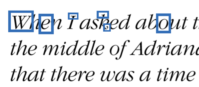
This first picture is an example of Modern typeface. We can see that it has radical thick/thin transition in the strokes(e), vertical stress(o), thin and horizontal serifs on lowercase letters(top of letter k), curved bottom line and thicker at the tip(k), no bracketing(W).
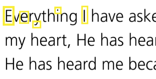
This second picture includes an example of Sense serif typeface. There are no visible thick/thin transition in the strokes overall, and letter-forms are the same thickness all the way around. We can also find no serifs(the edge of every font) and no stress as well.
As I have mentioned above, two typefaces from different categories were used. These two typefaces have a contrasting relationship, so it appeals and draws the readers’ attention. I have marked the distinction with square boxes in each picture. In the text field of this article, we can recognize that each paragraph has different contents as text fonts are from different categories.
Photography
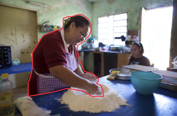
Depth of Field is mainly used for this picture because Adriana is the focus of this article. We can see that because 1. She is the biggest form in the picture. 2. She is the most clear in the picture as everything else around her is out of focus. 3. She is also wearing the color(red) that contrast to the environment that she is in.
Alternate Images
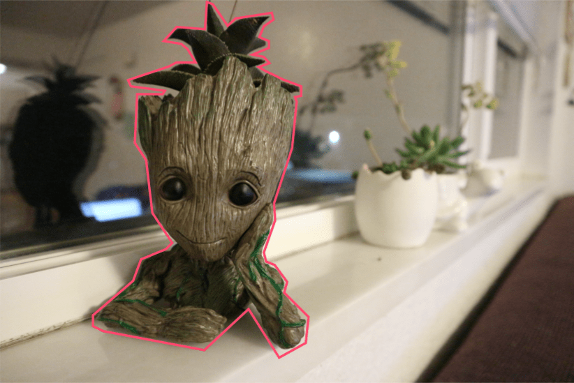
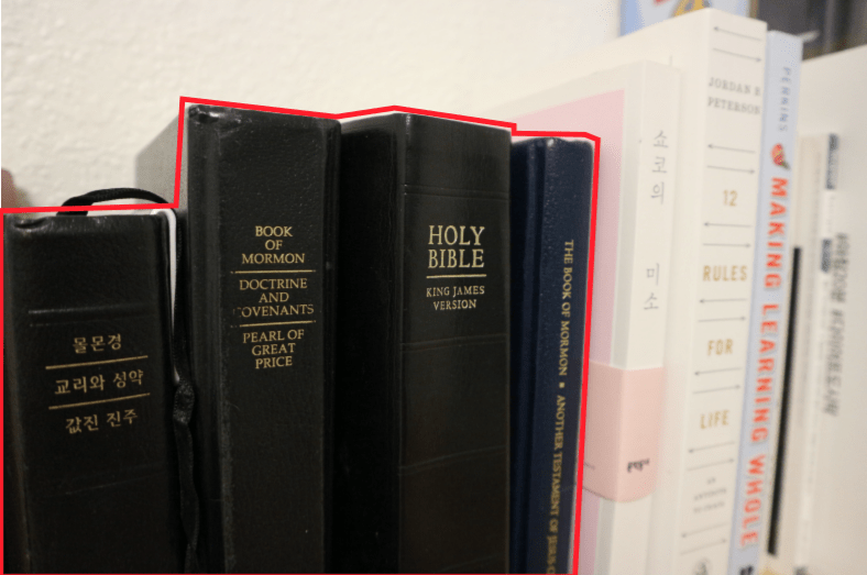
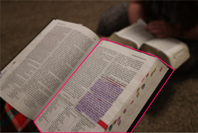
Like the photography used in the original article, I used the depth of field photo composition. I also tried to take pictures related to the article. Because the article talked about her experience when God answered her prayer, self-reliance, and family, I chose the following subjects for my pictures.
The first picture is one of the plants in my living room. I thought taking care of plants is very similar to strengthening our Faith in that we have to keep nourishing it. As Adriana is working on food in her picture, we also need patience, dedication, and consistency to build up our faith just like taking care of plants.
The second picture is the scriptures, which are the word of God. I had others books next to the scriptures, but I focused on the scriptures to show that the gospel should be the center of our lives. Similar to Adriana’s table, although I have several books, I still choose to put scriptures in the center of my life.
The last picture presents family scripture study. As Adriana mentioned, through studying the scripture, we can discover who we are as His children and be more self-reliant. As we read the scriptures as a family, we can help and strengthen each other as well.
Summary
Using different typefaces in the article helps distinguish descriptions from the article’s actual content. Using the depth of field composition helps us see who the article focuses on, as well as give us a general idea of what the article will be about, s the photograph not only depicts Adriana, but her kitchen and family as well, which she references in the article.