
By : Pandora
Introduction
This advertisement was created by Pandora in April 2017, it was specifically for promoting one of their plans, the Premium Plan. Pandora is a leading music and podcast discovery platform, and it provides numerous content to users based on the plans. There are about 70 millions Pandora users. The original design can be found at : https://blog.pandora.com/us/sounds-like-you/
Contrast
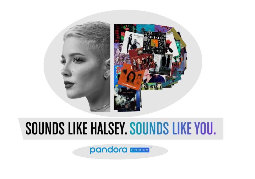
In this advertisement, we can find several contrast elements. The white background contrasts with the pictures and text of the advertisement. We can also recognize it is as separated in two parts, Halsey’s face and text below her is juxtaposed by the letter “P” made up of several album posters with corresponding text below it.
Alignment

In this advertisement, the pictures, text, and logo are center-aligned. It helps the viewers to feel the content of the advertisement belongs to the same piece, and it keeps this advertisement looking unified and organized.
Repetition
We can find some repetitions in this advertisement as well. It is used for the shape of the pictures, the font of text, the size of font, and the wording of the sentences. It is helpful for drawing attentions from the viewers.
Proximity
Proximity is also founded in this advertisement. They used black and white coloring for the left content and colors for the right content. It helps the viewers to recognize the relationship of the content (Halsey’s face – SOUNDS LIKE HALSEY / “P” – SOUNDS LIKE YOU). The gaps between the content also show proximity. The gap between the pictures and the text, “SOUNDS LIKE HALSEY. SOUNDS LIKE YOU,” is shorter than the text and Pandora logo. This spacing helps organize the content in the advertisement into several units.
Color

Pandora used only few colors to keep this advertisement simple. Overall, black and white, and a triad of colors(yellow-orange, aqua, and violet) is used in this advertisement. They even used the triad of colors mostly in the “P” with a bunch of album posters. They also kept the signature color for their logo, which is aqua. The text, “SOUNDS LIKE YOU” uses shades and tints of violet color. Overall, it creates harmony.
Conclusion
In this advertisement created by Pandora, basic principles of design (Contrast, Alignment, Repetition, Proximity, and Color) are used. These principles make the advertisement more clear, interesting, organized, and unified. I think it worked very well in this advertisement. Although it is very simple and short in wording, it delivers the messages well.
